
See the Credits page for a list of the original photographers.
Want some background? Click me!
The visuals on this site have taken wildly different forms over the years. One of the biggest challenges I faced renovating and re-designing TAD was how to present so much information while still infusing it with the passion I have for the visuals and their connection to the music. I love design, but sometimes I struggle to maintain the right balance between form and function. There have been at least 3 different versions of this website structually and visually. Honsetly, my biggest ally was being willing to completely trash something I spent a lot of time on but didn't ultimately work. Since most of my focus the last few years of building the site had been on the programming, I didn't find a real voice with the visuals until I reached the homestretch. Once I galloped toward the finish line, most of the designs you see only took me about a few days to complete. Getting to a sweet spot was, in some ways, artistically agonizing, but also rewarding. In the real world, I'm much more at ease with paint, graphite, or clay, but when I found myself no longer able to paint or draw due to health reasons in the early 2000's, I turned to the digital world to quench my thirst for creative exploration and expression.
When I began this crazy journey to renovate the site late 2009, most of my experience up to that point had been informed by small-scale websites before the mobile age exploded. For the first year or so I worked on it, I focused entirely too much on the visuals, and as a result became stagnant. Many web developers start with the structuring of content and build the designs around it, but I have often worked in the reverse. When I found my usual tactic wasn't working, I stopped dealing with the designs completely and just coded my brains out -- only working on the artwork when I was too burned out or under the weather to do anything else. I'm truly grateful I did it that way, because I think it took more than a year for my brain to absorb current design trends and mobile-friendly visuals. Hopefully the long wait has garnered a pay-off in the end.
Tori's artwork has always been an intimate part of experiencing her music for me.
From this website's inception, I envisioned a way to share my connection and passion for Tori's artwork with the viewers without losing the necessary support for the information-heavy content. I wanted the user, be it casual or die-hard fan, to feel as though they were stepping into another world. Pulling that off was another story. Because I hand-coded virtually the entire site, I had complete control on everything that was seen, and that has been both a blessing and a curse. It was overwhelming (and clearly time-consuming), but in the end I hope that everyone leaves feeling they have a better sense of the music through just the imagery alone. A girl can dream, at least!Below are some descriptions of what each Era artwork means to me, and why I chose to represent it the way I did. In case anyone is interested, that is. I have no idea honestly if this is interesting. But let's give it a whirl. Click the images below to learn more.
 Myra Ellen Era
Myra Ellen Era
When attempting to capture this era of Tori's life, what flooded my mind was her innocence and the fresh musical experiences in her youth. I wanted something that looked hand-drawn, with faded colors to emote nostalgia, and also bring in some small feminine touches. The words emanating from her are lyrics from her first self-penned single, "Baltimore". Y Kant Tori Read Era
Y Kant Tori Read
Anyone who has seen the artwork from this era knows that the visuals aren't always flattering or representative of the Tori we now know and love. That said, through imagery I wanted to help light the sentimental torch this record carries for over-the-top 80's sound; a homage to the bright colors and graffiti art of that decade. Little Earthquakes Era
Little Earthquakes Era
This design took me by far the longest out of all of them to work out. I created a very complicated -- and entirely different looking -- design for this era some years back, and it took me a while to realize it was total bunk. Perhaps the early incarnation of this design was nice to look at on some levels, but ultimately it was impractical. One day, when brainstorming about simple boxes and their theme on the album liner notes, I found a photo of nested boxes in an Etsy shop, and fell in love with the idea of turning it into a sketch and watercolor. The owner of the shop graciously allowed me to use this image in my design with permission. The video montage inside the separate boxes is one of the oldest parts of the site that I decided to keep. I created it during the time I was investing way too much time and energy on the visuals, but for her very first solo album, that decision was fitting in hindsight. Under the Pink Era
Under the Pink Era
Similar to the Little Earthquakes design, this era also had quite a few incarnations, but the spirit of it always remained constant. I ended up creating 3 different works that I ultimately couldn't choose between (two are variations of one another), so now this era's artwork is randomized between multple designs (depending on device). For the glass orb, I wanted the elements to feel crystalline and faceted with a focus on shifting light and dappled colors, all set within a glass-cut world. The sounds on this record also evoked a kinesthetic watercolor spatter across my mind, which I created quite literally. The visuals on this album are some of my favorite, and I'm happy to include all of my various indecisive visions. Boys for Pele Era
Boys for Pele
The Boys for Pele design was very important to me since it is my favorite album. For the years I worked on this website, I fantasized about turning Tori into some kind of Goddess of Fire. Given the many references Tori had made in interviews about stealing fire from her relationships and how this this record was about deciding to create her own, it was a beloved image I had formed in my head at a young age. The titular allusion to the volcano Pele was yet another reason why I wanted to bring that image to life. However, I didn't feel comfortable attempting to recreate what I saw in my mind's eye until recently. I hope the finished piece resonates. From the Choirgirl Hotel Era
From the Choirgirl Hotel Era
This is easily my 2nd favorite album (sometimes in the top spot depending on the day). The lyrics make quite a few references to water, and amidst the chaos of what is happening to Tori at various stages of the album, she seems to take great refuge in her liquid cocoon. "There's a sea secret in me"..."I guess I'm an underwater thing so I can't take it personally". Even the body scans on the album artwork are reminiscent to me of being under the flow of water. With some thought to counterpoint Pele's fire, I chose to represent her as the water creature which swims deftly through the lyrics of this stunningly dynamic record. To Venus and Back Era
To Venus and Back Era
This era naturally lent itself to space and the cosmos, with the planet Venus spinning behind Tori. I'd like to think of the different constellations as representations of the various "sonic shapes" Tori so frequently spoke about while being interviewed about this record. Strange Little Girls Era
Strange Little Girls Era
The manner in which Tori assumes different identities on this album is intriguing to me. She morphs herself into almost unrecognizable forms, which draws a paralell to the idea that, embedded within any narrative, there might exist another viewpoint or voice unheard. The background colors are very neutral, but I chose to contrast them with bold imagery to represent some of the musical choices she made in this dark and haunting record.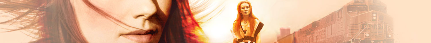 Scarlet's Walk Era
Scarlet's Walk Era
One of my favorite albums by Tori, I let the stunning imagery speak for itself: a figure of Scarlet walking into a desert sunset, a train calling in the distance, with her windswept hair as the sky. The Beekeeper Era
The Beekeeper Era
Regardless of my personal feelings about the Beekeeper musically, the concept behind it has rich visual potential. The honeycomb, gardens, bugs, birds, and bees -- a lot of fun elements to play with. There are themes on the record about seeding, blossoming, and luxuriating in the senses, which I tried to represent with nuance. A Piano: The Collection Era
A Piano: The Collection Era
As far as box sets go, this has to be one of the most creatively put together I've personally seen (and I don't believe that opinion is just bias toward Tori). I wanted the the piano to represent fertile ground for creativity: ideas, images, stories, and other worlds, sprouting Tori's entire career. Fade to Red Era
Fade to Red Era
When I create a design, I like to experiment with something other than the fruit that hangs lowest. Even though the titular reds are present, I wanted to convey her "fading" in a slightly different way. I like the idea of progressing from watercolors to a focused image to spheres of the different videos springing from her creative mind. American Doll Posse Era
American Doll Posse Era
This energetic rock album is heavily political, and the banner of the flag running over Tori's face expesses that tone for me. I also liked adding a bit of grunge and messiness to the scene, which is something I think the original liner artwork featuring the dolls only hinted at. Live at Montreux Era
Live at Montreux Era
There aren't a lot of images to choose from on this concert album, but the images which are present are unexpectedly captivating to me. I think young Tori at this stage is quite wonderful. I enjoyed turning a grainy video screenshot of her second performance into something hopefully evoking retro sensibilities. Midwinter Graces Era
Midwinter Graces Era
If any of my designs were guilty pleasures, this one would be it. I indulged in the idea of her being represented as the Snow Queen or a similar magical winter creature. I approach altering Tori's likeness so drastically very cautiously, since it isn't hard to find examples of less-than-stellar manipulations of her images. But this design was just so unapologetically fun to do, and hopefully I captured the spirit of the album. From Russia with Love Era
From Russia with Love Era
With this era artwork, I attempted to re-create the abstracted orange piano design nestled inside this unusual box set. I wanted music and flourishes spilling out from every direction, and Tori with Russia behind her, classically captured in true lomography form, and her peering at us mysteriously. Night of Hunters Era
Night of Hunters Era
There is nothing subtle about this record, and I purposely created the artwork to match. Many of the lyrics refer to the woman in this story (Tori) as fire, the man as water, and the "Night" as a vision quest during which she is visited by shape-shifters. These magical beings reveal that various facets of her relationship are ancient and cyclical. So, no shortage of inspiration here. Gold Dust Era
Gold Dust Era
"We held gold dust in our hand" is a lyric from the titular song of this record, which I wanted to capture quite literally (and hopefully infused with some magic). Unrepentant Geraldines Era
Unrepentant Geraldines Era
The imagery on this album was the best of any since Scarlet in my opinion, and this photo of her standing captured such strength, poise, and a sense of being unapologetic. I wanted to represent the great works of art Tori spoke about as her inspiration for the songs by creating a figure of her exploding with color and paint -- or being formed by the paint, depending on your perspective. Home Page
Native Invader Era
With Native Invader era artwork, I was exploring the themes of duality in nature as it is reflected in our own being, which the album so skillfully explores. I have always loved the “double exposure” technique, and hoped it could express a sense of the power and beauty of the music. Home Page